Tablz's Restaurant Discovery Portal

May 2023 - August 2023
grid_view

Overview

Tablz is a table reservation platform connecting diners with curated partner restaurants, but its fragmented booking process lacked an intuitive way to explore venues and compare table options.

As the UX/UI Designer, I developed the Restaurant Discovery Portal to streamline the experience, boosting user engagement and table booking conversions.

Role

UX/UI Design, User Research, Interaction Design, Design Systems

Team

3 UX Designers

Duration

3 Months
star

Highlight

search

Context

Understanding the Limitations
Tablz’s platform only allowed users to browse one restaurant at a time, offering no way to compare venues or explore multiple options efficiently. This lack of flexibility created friction in decision-making, leading to drop-offs after just 2–3 clicks.

Users needed a way to seamlessly browse, compare, and reserve without feeling restricted by the platform’s structure. A more dynamic, visual, and flexible system was critical to keeping users engaged and increasing table bookings.
extension

Problem

And with a growing user base and expanding partnerships ...
How might we help users seamlessly discover and book tables while minimizing drop-offs?
lock

Project Constraints

Starting from Scratch
Tablz’s web platform had no existing components or research to build from. This meant designing everything from the ground up, creating both a new exploration model and the first light-mode product for the company.

While the lack of existing structure posed challenges, it also gave us the freedom to innovate. We leveraged rapid iteration and constant usability testing to shape a scalable, visual-first, and user-focused system.
explore

User-flow

Understanding Current Friction Points
Users were restricted to viewing one restaurant at a time, making comparisons difficult and increasing decision fatigue. Drop-offs after 2–3 clicks signaled that the system was unintuitive, causing users to abandon bookings before reaching checkout.

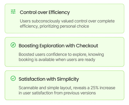
Through usability testing, and observational research, we identified that users struggled with repetitive inputs, re-entering details like guest count, date, and budget multiple times. The checkout process was buried 8–10 steps in, leading to unnecessary friction.
Always 1 Step Closer To Check-out
We restructured the user flow with a progressive approach, ensuring users could modify key details at any stage without disrupting their journey. Auto-save eliminated redundant inputs, and checkout was made accessible at nearly every step.
Driving Engagement and Retention
Usability tests showed that 66% of users preferred adjusting details on the go rather than entering them upfront for search filtering. This reinforced that user control was more valuable than rigid efficiency.

Post-design surveys confirmed that simplifying inputs and making checkout readily available increased user confidence and reduced drop-offs.
palette

Visual Design

Restaurant Cards: Simple, Focused, Designed for Action
Cards aren’t meant to tell the whole story. They’re a starting point to encourage further exploration. Too much information upfront slows decision-making and creates friction, so we kept them light, structured, and scannable.

We used Information Architecture (IA) to create a systemized approach to scanning and decision-making.
Visual-First Layout: Leading with Images
Large hero images highlight high-value partners, trending spots, or seasonal experiences, making the first point of engagement both visually compelling and strategic.

This layout not only drives visibility for featured restaurants but also nudges users toward making decisions faster.
Scannability & Structure
We initially expected a Z-pattern scanning behavior, given the visual-first layout. However, heatmaps revealed a more linear, top-to-bottom pattern, influenced by the large hero image and structured content blocks.

This insight allowed us to orient cards for user traction.
palette

Interaction Design

Smart Previews: Adapting to Different User Behaviors
Our previous design forced users through a one-size-fits-all journey, requiring a full-page visit before seeing table details. This worked for Explorers, who preferred deep dives, but Decisive Bookers found it inefficient. To solve this, we introduced a three-tiered browsing system that allowed users to preview, compare, and fully explore at their own pace.
Three-Tiered Exploration System
To accommodate different decision-making styles, we introduced a three-tiered system that let users preview, compare, or fully explore restaurant options at their own pace. This ensured that users weren’t forced into a rigid journey but could access details in a way that suited their needs.

Expand Modal

thumb_up

Surfaces key restaurant details like ambiance and top table choices, helping users make quicker decisions.

thumb_down

Lacks in-depth details, requiring some users to open the full restaurant page.

Restaurant Page

thumb_up

Provides complete confidence by showing all restaurant details, including menus and immersive images.

thumb_down

Can cause decision fatigue if users open too many pages without an easy way to return.

Dropdown

thumb_up

Eliminates unnecessary clicks by allowing users to scan availability, pricing, and seating at a glance.

thumb_down

Limited details, leading some users to open a modal or full restaurant page for more information.

widgets

Design Systems

Creating a Scalable Foundation
When tasked with solving responsiveness issues across devices, including scaling for larger monitors, I saw an opportunity to create a Variable Design System that would streamline the Restaurant Discovery Portal and future-proof Tablz’s design ecosystem.

Figma had just launched Variables, and I explored how they could enhance efficiency, reduce manual work, and improve consistency across the platform. This led to the development of Tablz’s first Variable Design System, ensuring seamless adaptation across mobile, tablet, desktop, and large screens.
Streamlining Responsiveness with Variables
Leveraging Figma Variables, I built a light-to-dark mode system and created adaptive UI components that adjusted dynamically to different screen sizes. This minimized the need for duplicate screens in prototypes, making iteration and development 50% faster across all breakpoints.
Enabling the Team – Documentation & Training
Since Variables were new, I focused on reducing the learning curve by integrating them into Tablz’s existing Atomic Design System. I documented detailed guidelines on component scalability, semantic naming, and WCAG-compliant color optimizations, then led two training workshops to onboard designers and developers.
sports_score

Final Design

A Seamless, Visual-First Experience
The final design transformed Tablz into a flexible, image-driven platform that streamlined exploration and booking. A three-tiered browsing system enabled users to preview, compare, and deep dive into restaurant details without friction.

High-quality visuals became the primary decision-making driver, while structured layouts and auto-saving reduced unnecessary steps. The interface prioritized clarity, keeping users engaged and confident in their choices.

By implementing a Variable Design System, Tablz’s platform is now fully responsive across devices, reducing design iterations by 50%. The modular system ensures consistency and efficiency as the platform scales.
bar_chart

Outcome

Impact and Wins
While this project didn’t go live during the internship, our testing and research provided valuable insights that shaped Tablz’s design strategy. The project enhanced usability, accelerated design workflows, and improved platform scalability.

30+

Research Sessions Led

From usability tests, A/B tests, and user interviews, we gathered critical behavioral insights that directly informed product decisions.

30%

Quicker Time-To-Checkout

Usability testing showed users reached checkout 30% faster by eliminating repetitive inputs and integrating auto-save functionality.

100%

Variable System Implementation

The Variable Design System was fully integrated into Tablz’s design system, reducing design iterations by 50% and ensuring seamless scalability across all devices.

4+ Workshops

Onboarded the team on Figma Variables, ensuring smooth adoption across the design system.

40 Days Consistent

Continued refining the project daily even after the internship, ensuring final designs were fully polished and successfully shipped to Tablz.

8+ Presentations

Presented research findings, design decisions, and final prototypes to stakeholders, 3 of which were company wide.

120 Days Fitness

Outside of the internship, I went to the gym everyday (with 1 break day a week) and lifted around 30% more than before, focusing on controlled heavy lifts.

auto_stories

Reflection

Key Learning and Takeaways
arrow_forward

Falling Forward

Mistakes were inevitable, but they became my greatest learning opportunities. Understanding why I failed and how to overcome challenges refined my approach, ensuring every iteration led to better results.

local_library

Curiosity Leads to Growth

I didn’t lean on just existing skills, I embraced new challenges. My curiosity about Figma Variables started as personal exploration but evolved into implementation, education, and team-wide adoption. Passion and initiative don’t just improve designs; they open new opportunities.

sync

Design is Never Linear

The process was a constant loop of ideation, testing, and refining. Moving between these stages wasn’t a setback, it was necessary for creating a product that truly worked. Adapting quickly and embracing iteration strengthened both the design and my problem-solving approach.