
Wouessi's Tender Platform
Overview
I owned the end-to-end product experience: research, system architecture, and high-fidelity execution, delivering a scalable MVP.
Role
Team
Duration
Highlight

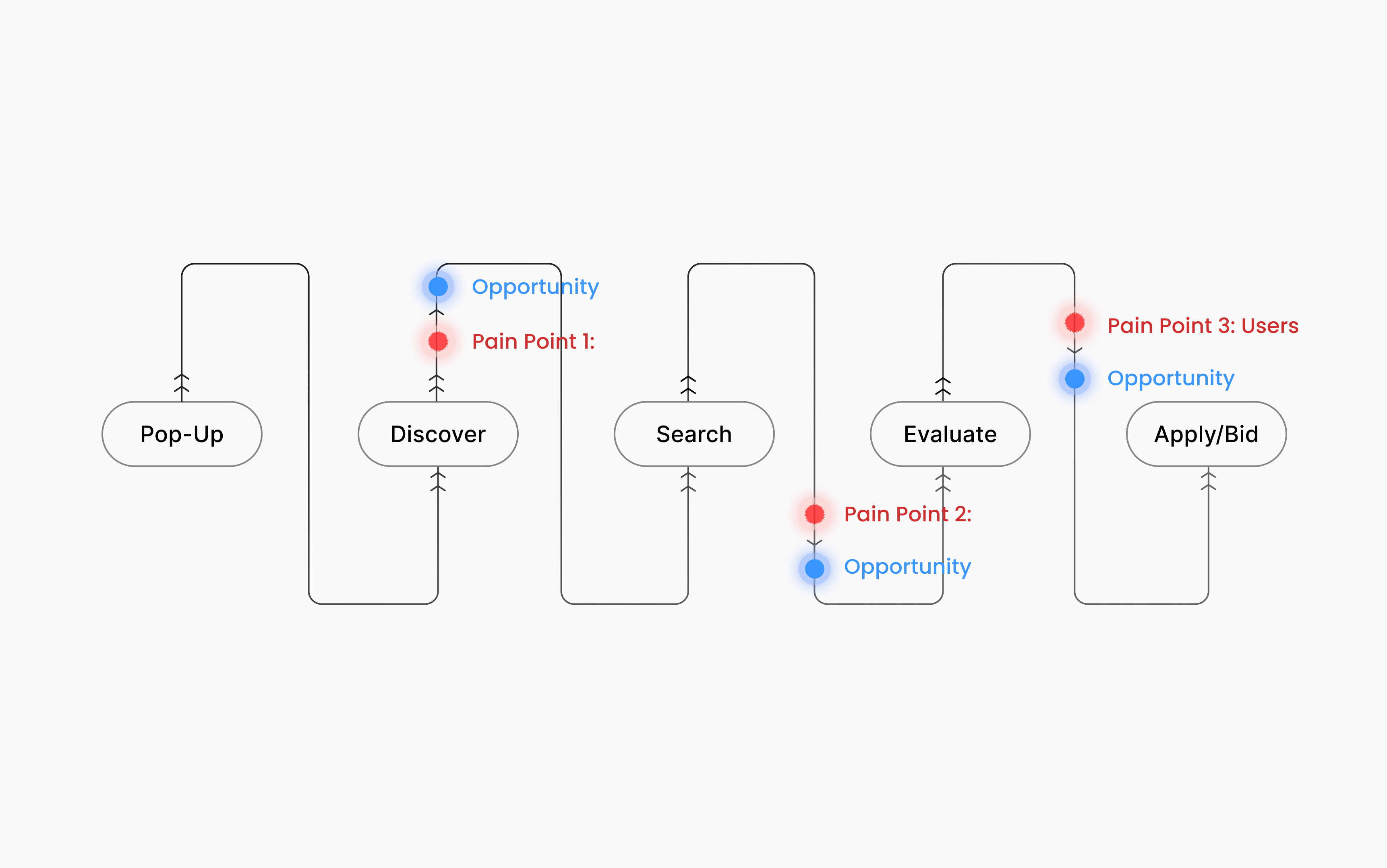
Problem
We saw an opportunity to improve this experience using AI. But introducing advanced tools in a space dominated by less receptive users to AI came with a challenge: how do you add AI-powered features without overwhelming them?
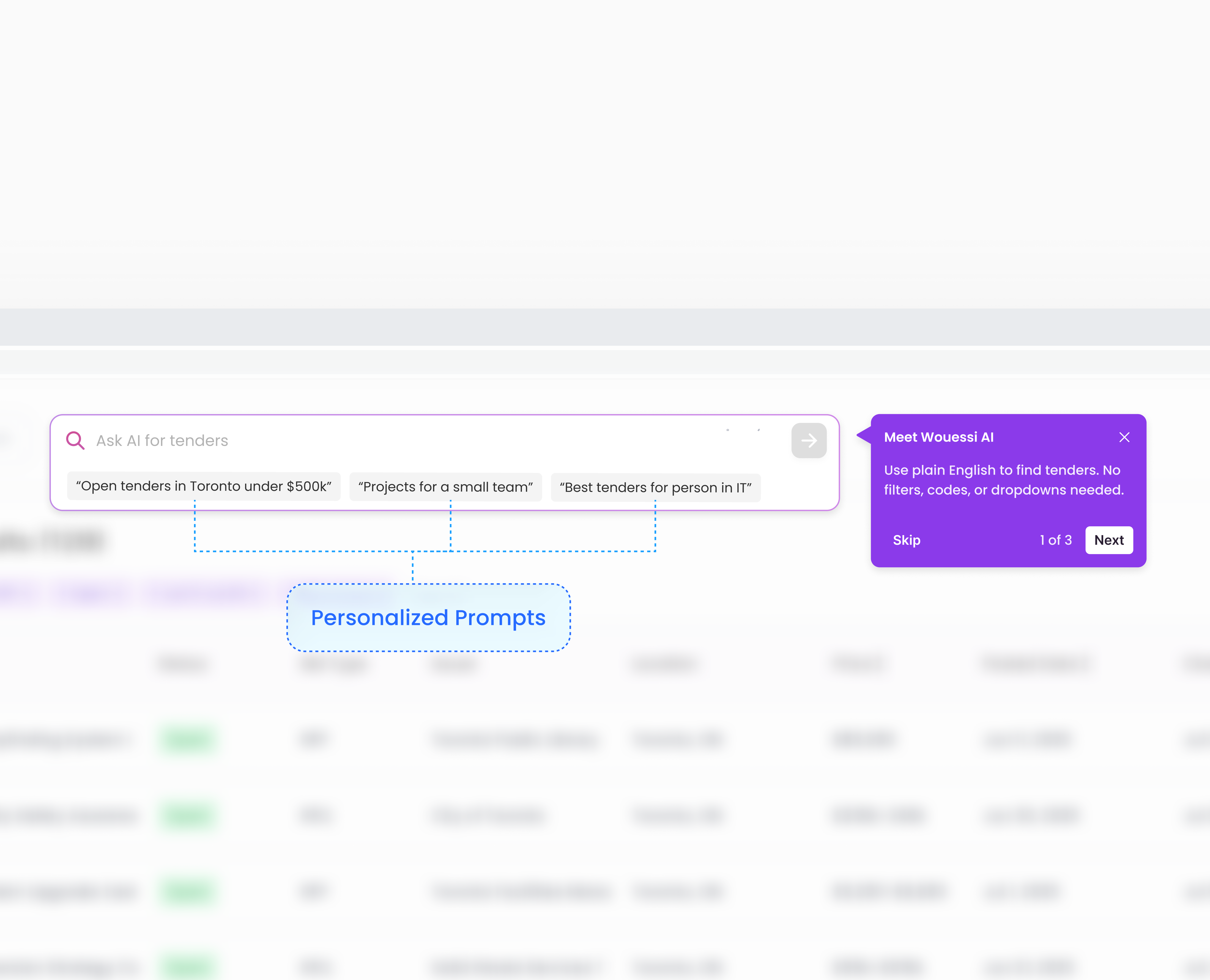
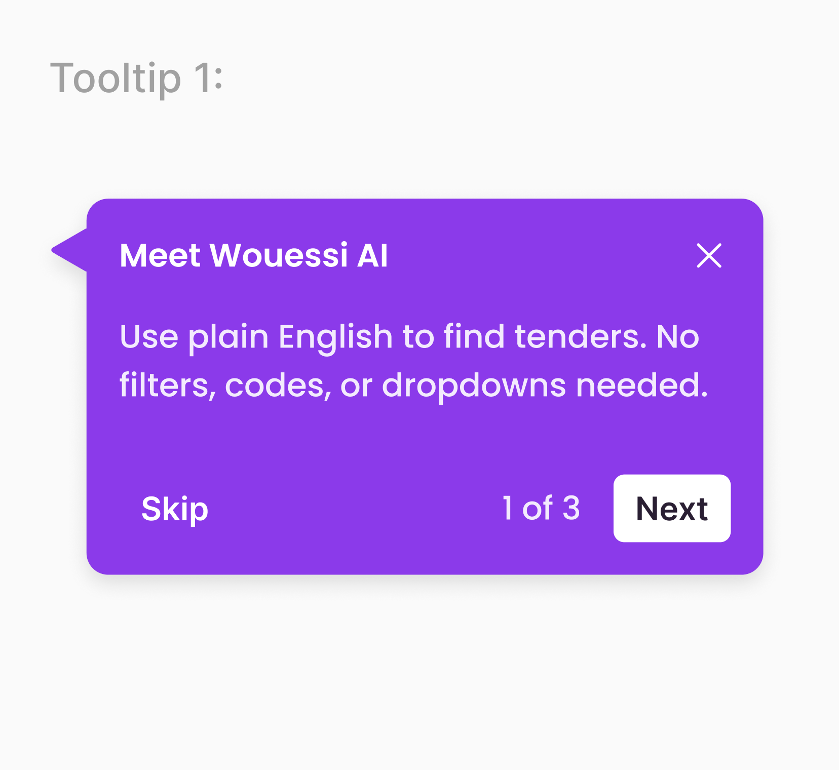
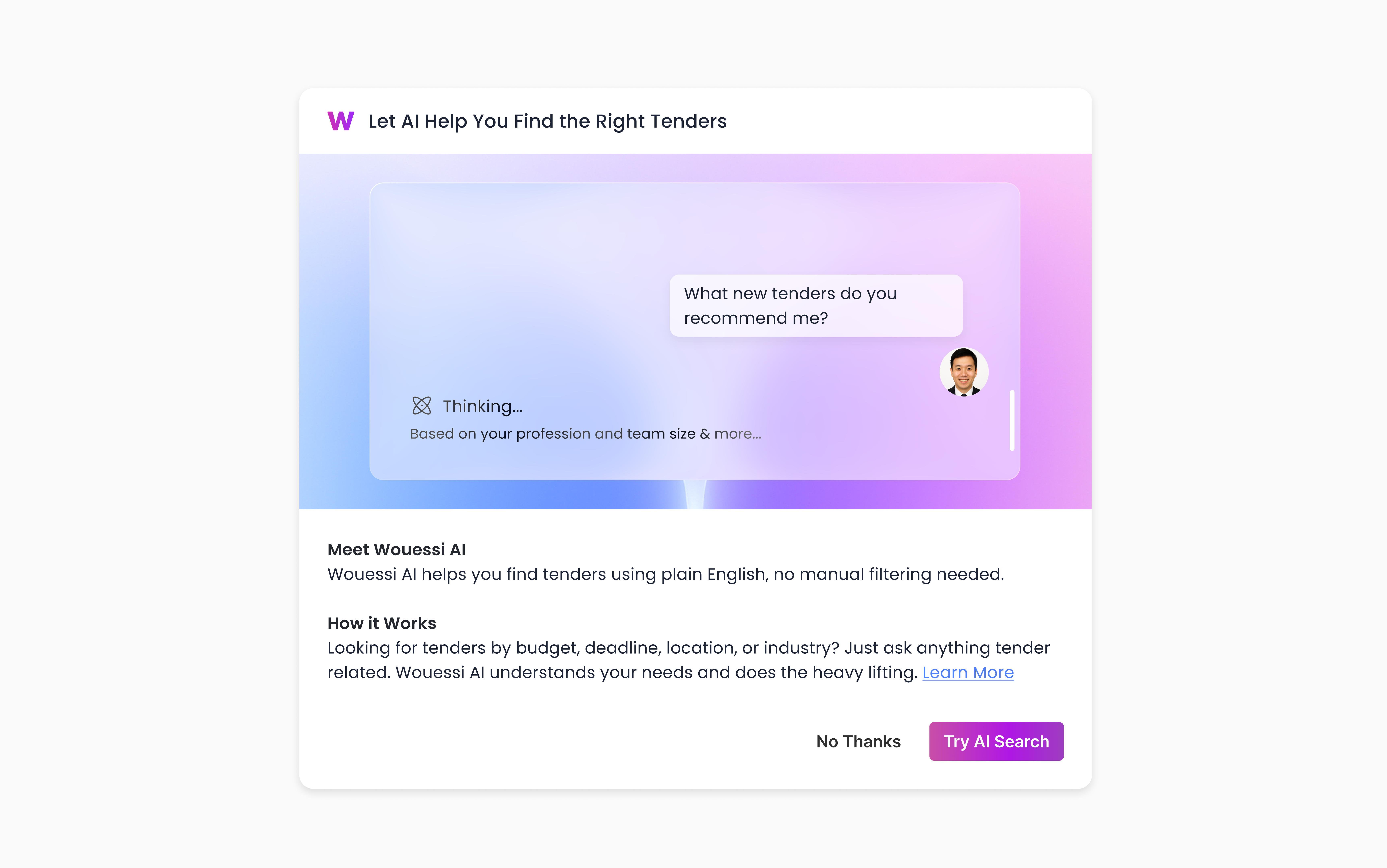
AI Search
The challenge: introducing this to a demographic unfamiliar, and less receptive to AI-driven solutions.
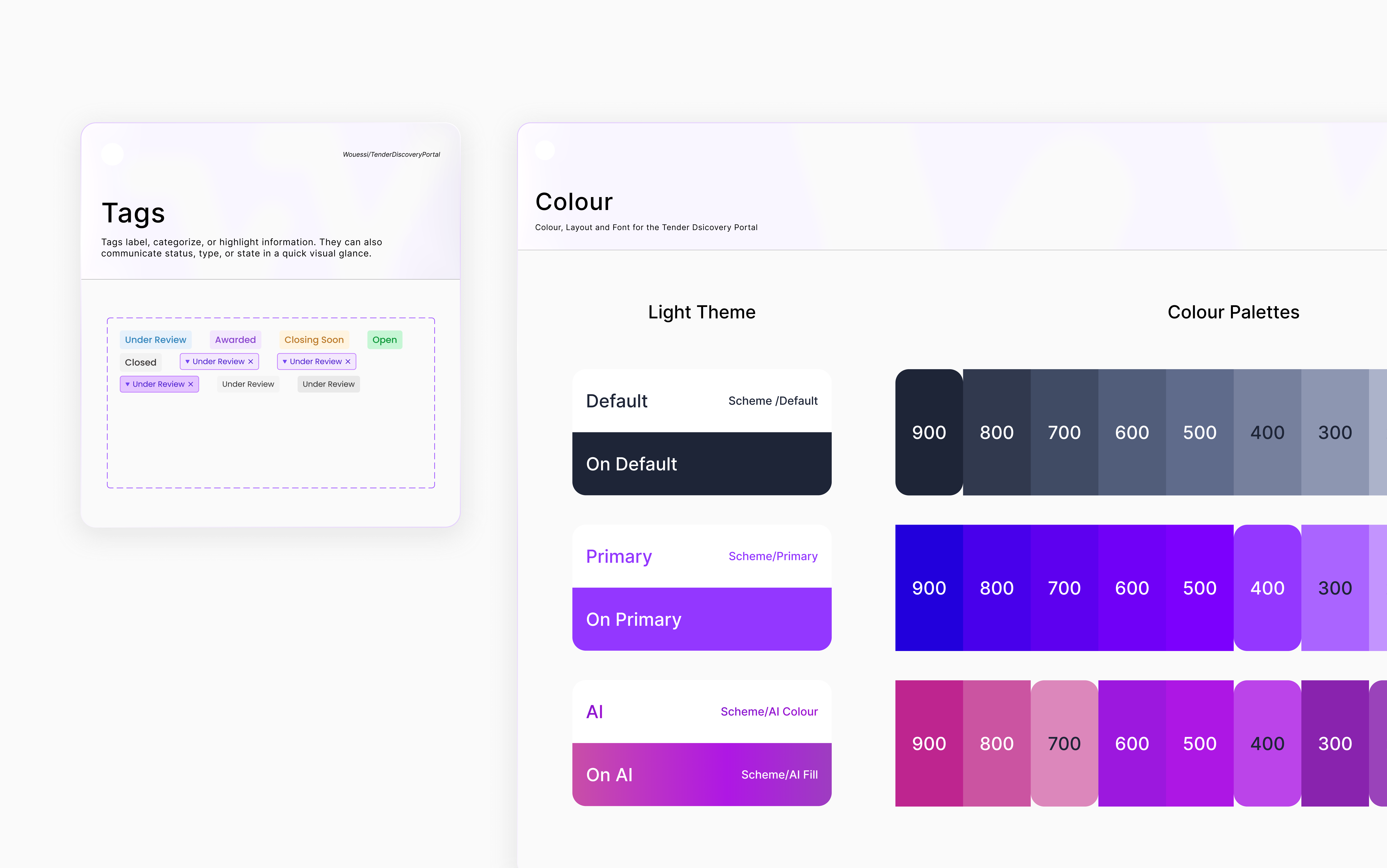
Cards
We knew the feature could improve discovery, but releasing it without context would provide no value. My goal became clear; Make AI Search approachable, relevant, and worth trying for users who didn’t yet see its potential.
However, data revealed low conversion and engagement. We concluded after interviews that users didn’t feel AI Search addressed a present problem. It appeared as an extra feature rather than a solution to their immediate need.
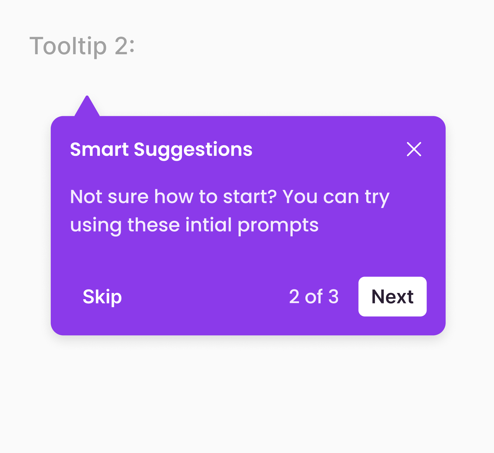
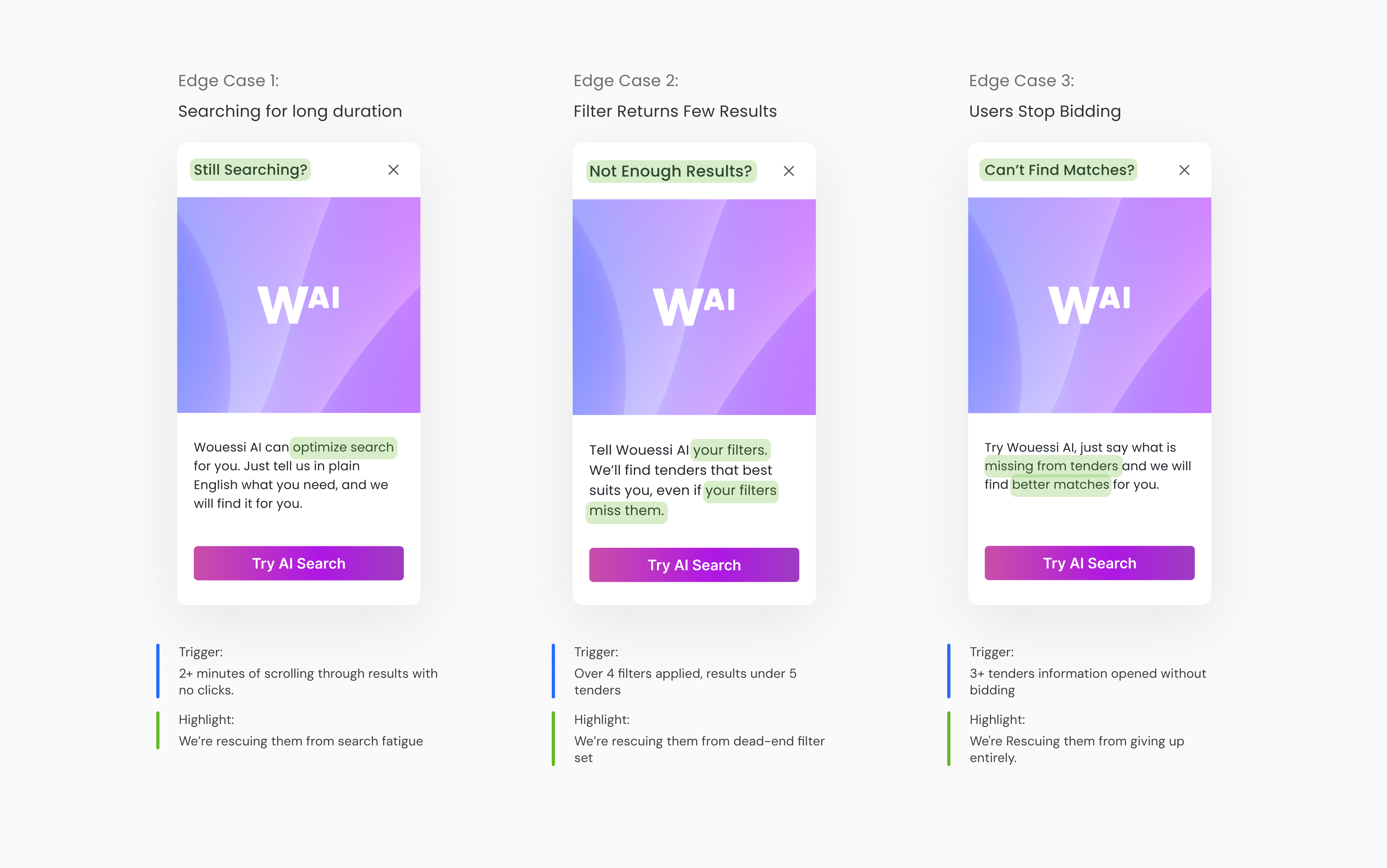
I pivoted my approach leaning into these pain points. I identified the three biggest ones and learned how we can utilize understanding users' emotions to uncover opportunities to support them.
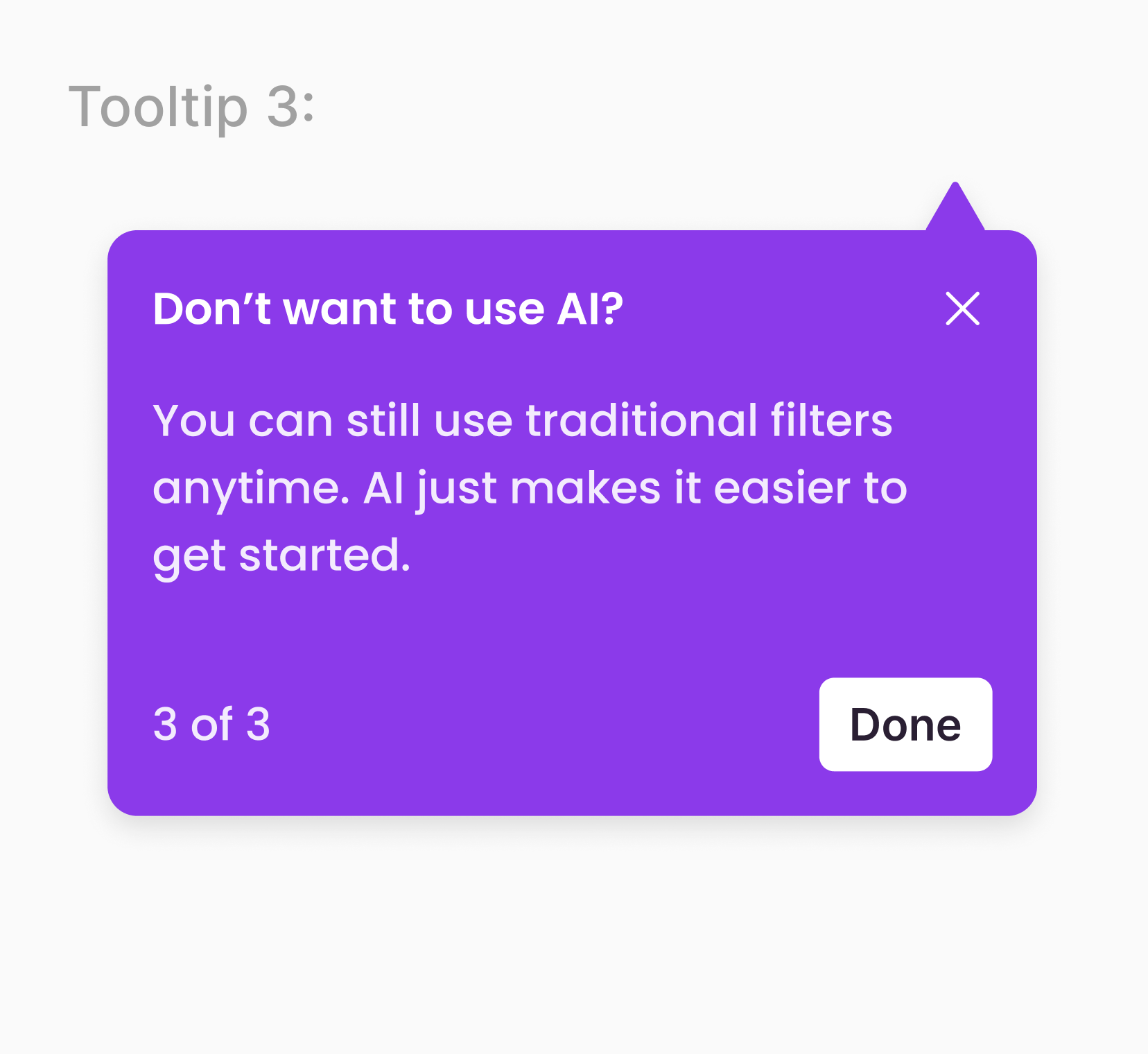
And instead of scrapping the initial pop-up entirely our research shared that users recognized the similar color themed and CTA which overall lessened cognitive load, and reduced time reading by 25%.
These cards dynamically matched real user situations. During internal testing, these contextual cards increased AI search engagement by 35% and situationally helps the users best suited to try AI search.
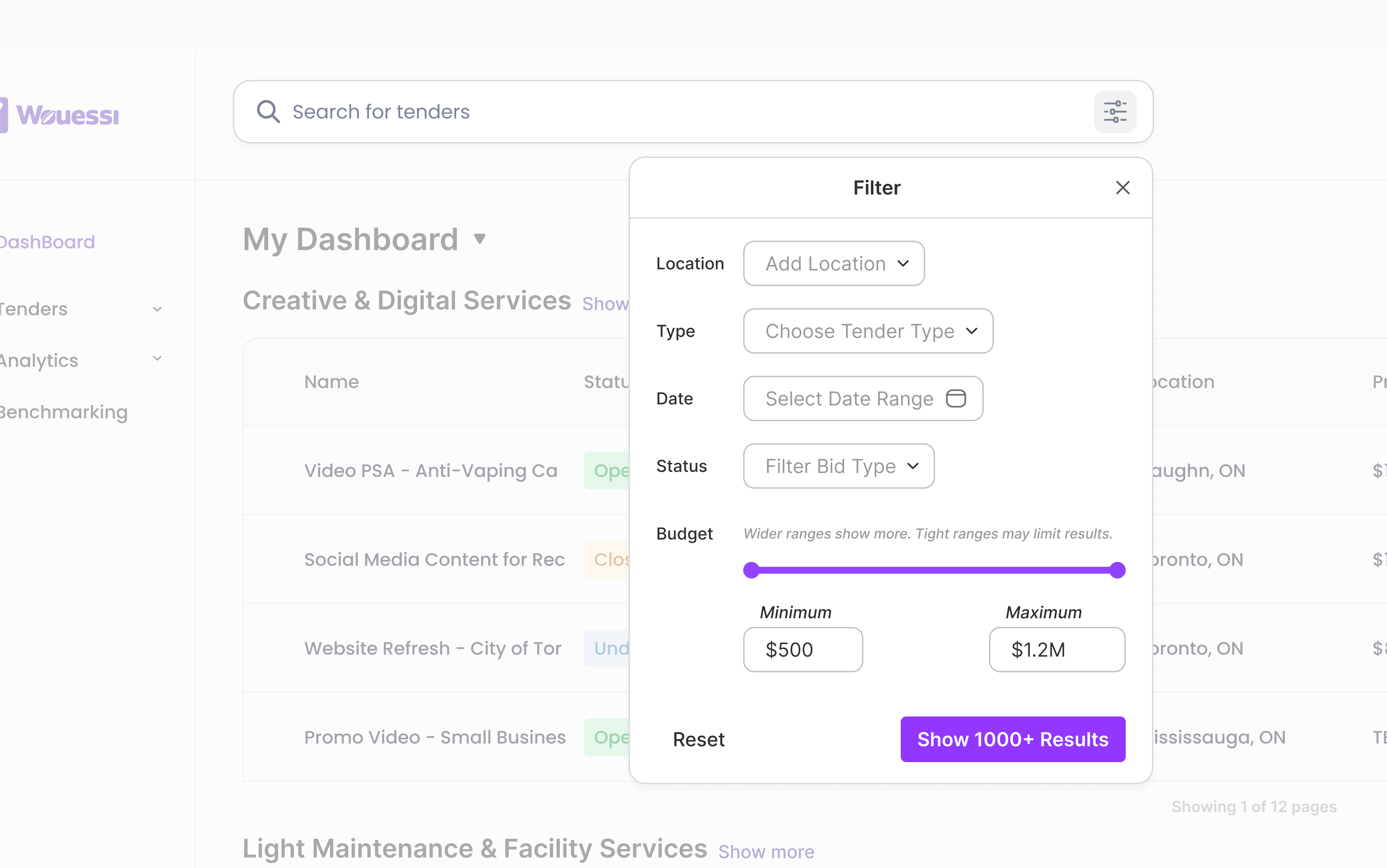
Filters & Manual Search
To design a seamless experience, we focused on what users value in manual search and how to reduce cognitive load.
Prioritizing what matters to users and simplifying the layout to make it feel fast and approachable.
These tags allow users to make small refinements like removing/change content without starting over from the filter icon. This design saves users an average of 30% in time.
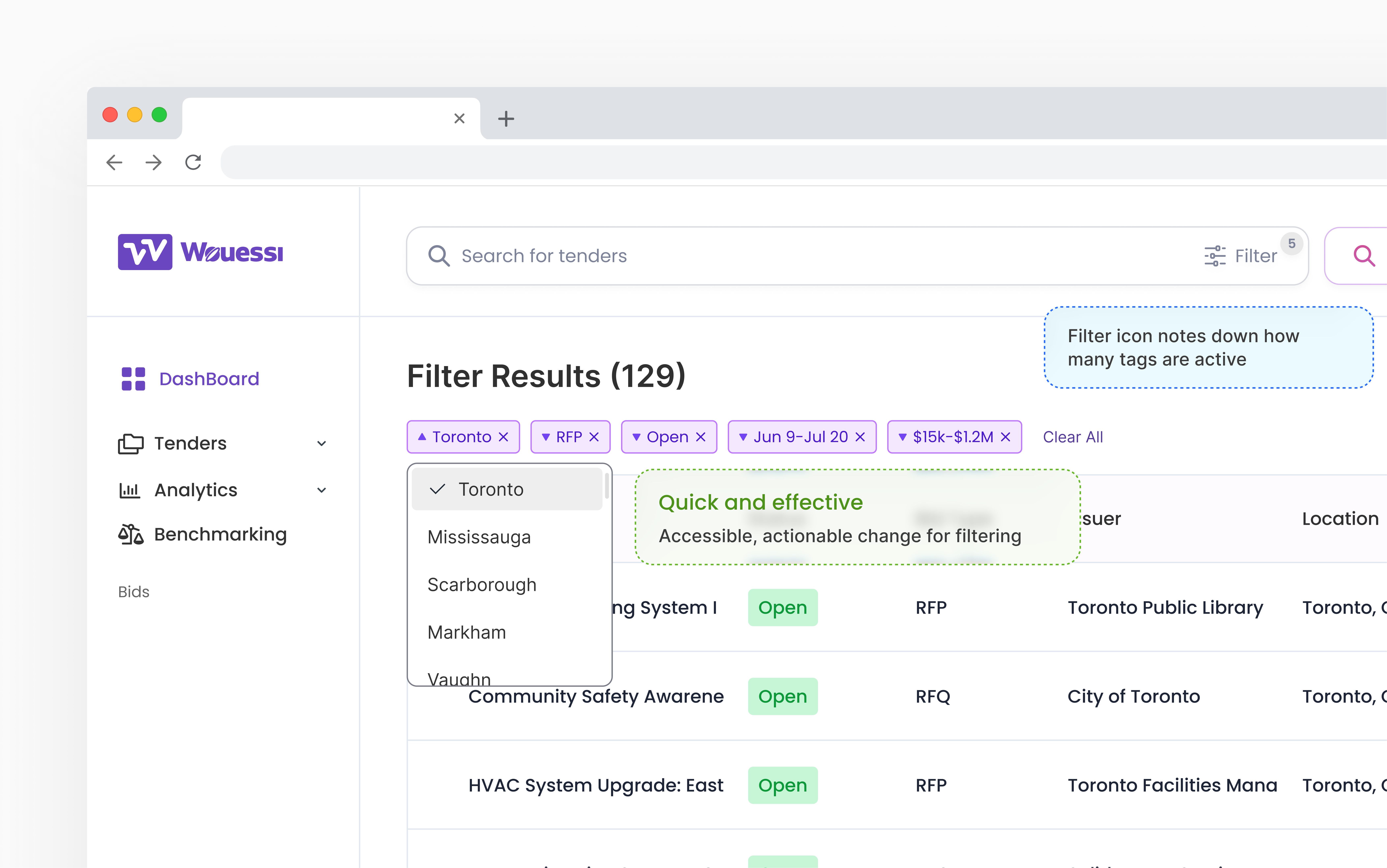
Because of that, I designed them look and feel like a cohesive experience. Kind of like a light switch (or toggle)... showing that similar relations between two features.
Visual Systems
Outcome
40%
Time on Task
Through reiterations, we developed a user-flow that reduced time on task by 40% with decisions to create less clicking and faster discovery
35%
Increase in click-throughs
After refining the rollout with timing and nudging strategies, clicks on AI-driven search results increased by 35% during internal research
200%
Handoff to Dev
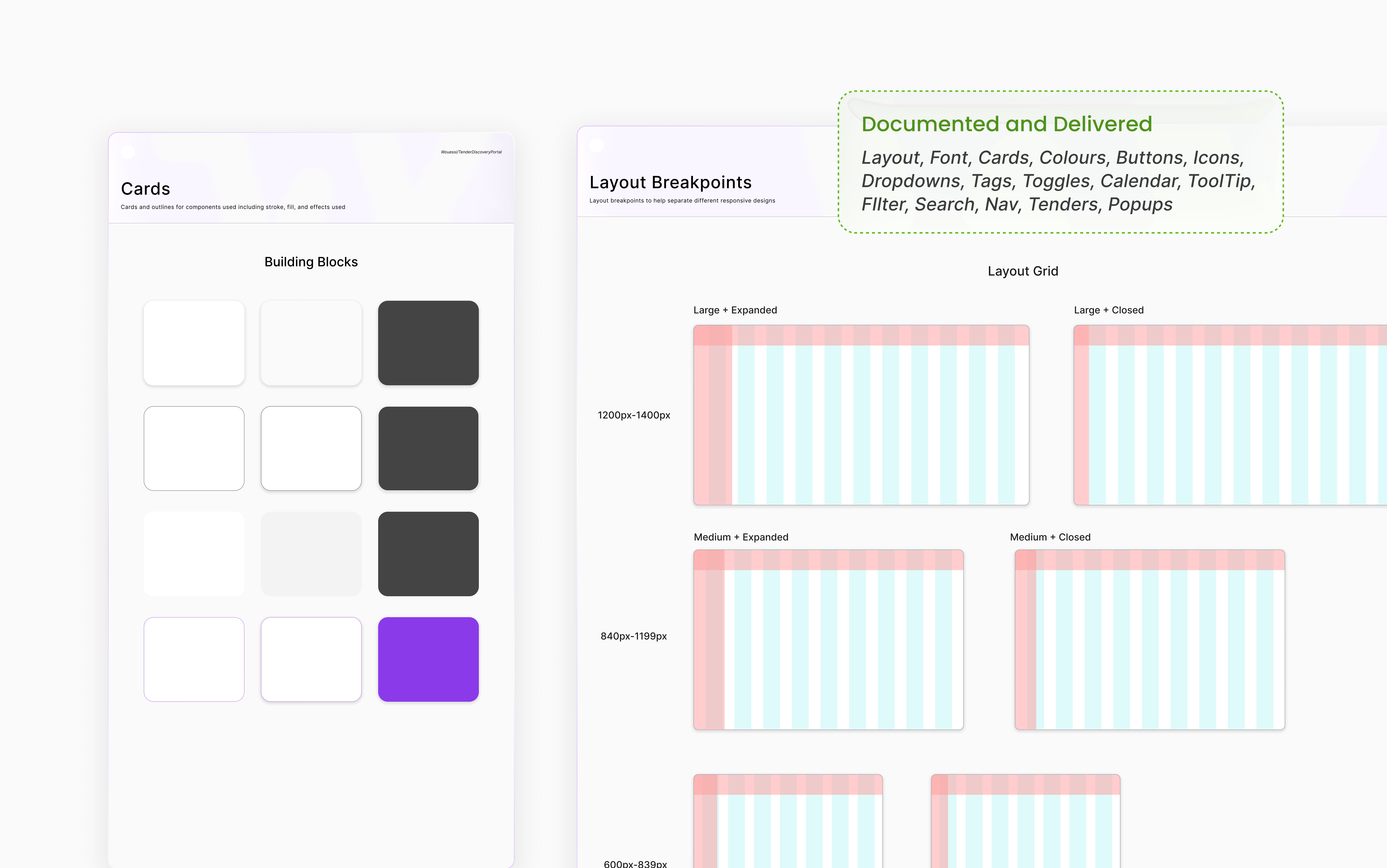
Successfully documented and delivered full scope (home page) + full design system, scalable components, and extra features for AI search (Pop-ups + edge case conversions)
Reflection
“Copying” is not copying
My curiosity always pulls me back to looking at apps I use every day. I love working backward, breaking down product strategies. That habit played a big role in this project, helping me shape features and strategies that ended up driving strong user satisfaction and stakeholder approval. I’ve realized that “copying” isn’t really copying, it’s about adapting smart strategies to your users’ needs and making them uniquely yours.
Opportunities Through conversation
Sometimes you really just have to ask. On this project, I shifted roles three different times, starting in marketing, moving into front-end, and eventually into product design. None of those transitions were formally planned; they happened because I was curious, spoke up, and asked leadership if I could help in different areas. Don't be afraid of rejection and clarify where you want to grow, I believe eventually you will get opportunities.
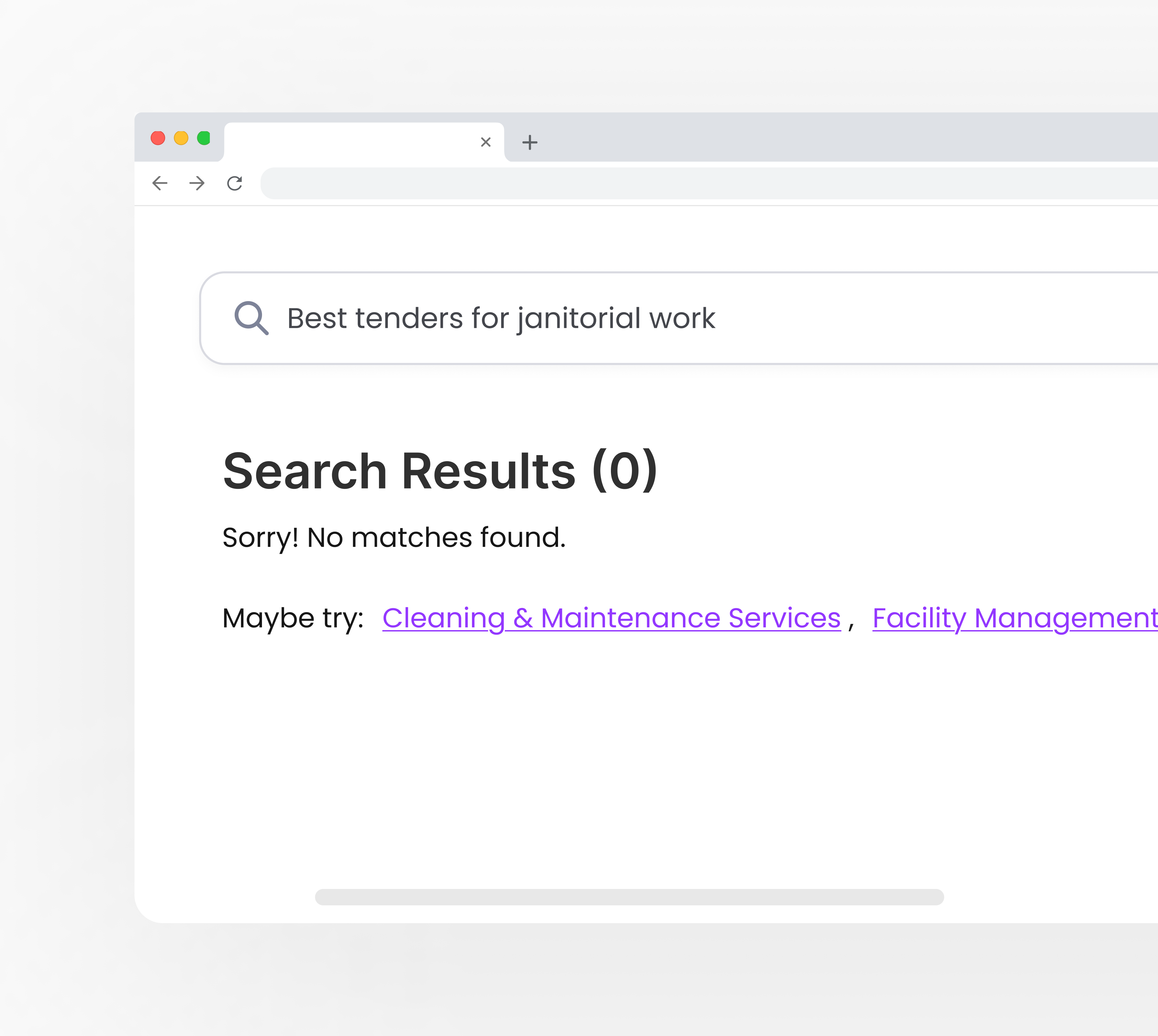
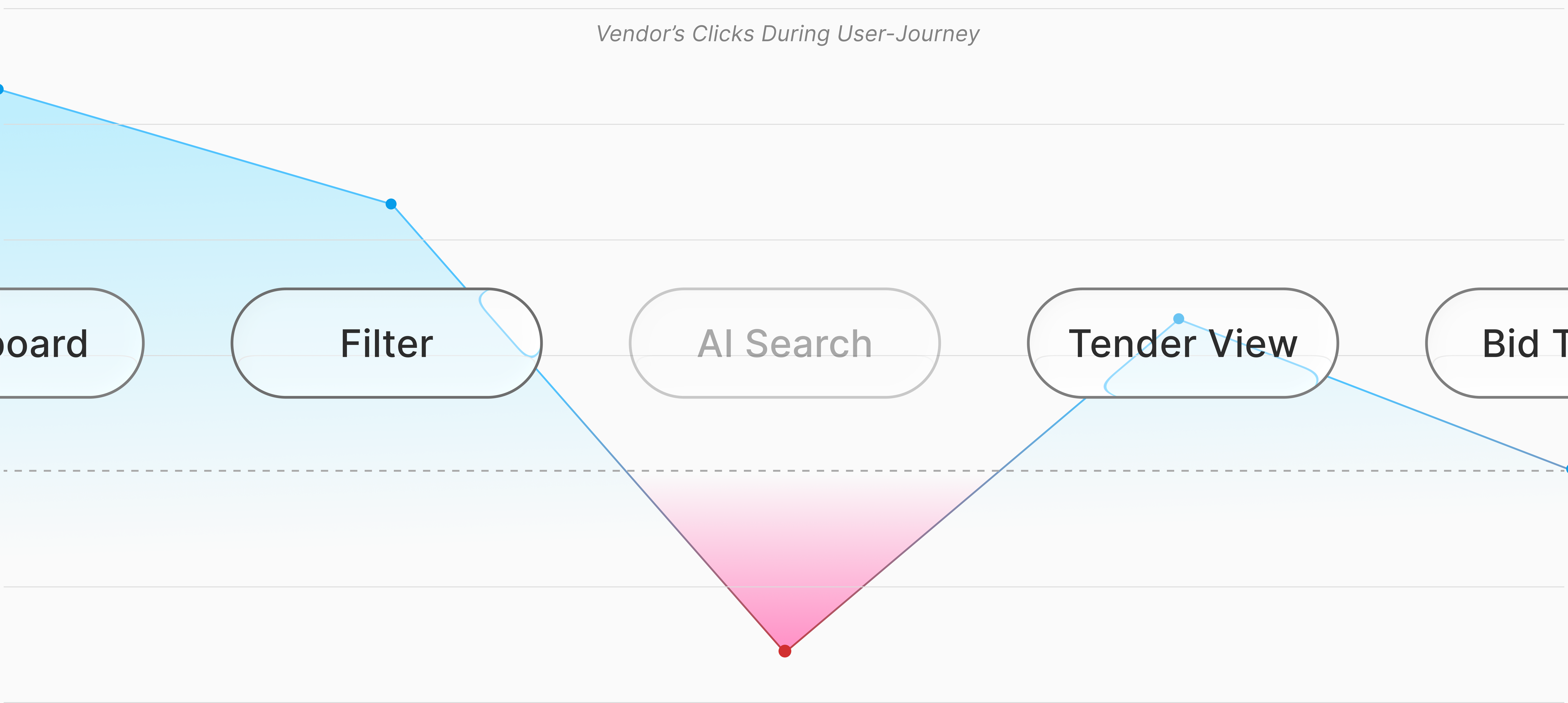
Users often abandon the platform after multiple failed searches